<img src="https://secure.intelligentcompanywisdom.com/781214.png" style="display:none;">

The Time and Temp Cop Out

admin

Recent Posts

Don’t be an EMC sign turkey

Posted by admin on Oct 23, 2020 4:12:59 PM

Last weekend I heard something banging on the window from my two sons’ bedroom. Above is what I saw when I walked in. A wild turkey. It took me a few minutes to realize what was going on. You see, turkeys are not the smartest of birds. I realized that this turkey was seeing his reflection in the window… and didn’t know it was his reflection in the window.  He was trying to communicate with a friend. A friend that was in fact, his reflection. But as soon as I moved closer to the window, he was able to see me (not a turkey) and that turkey, along with his buddy, high-tailed it out of there. 

Read More

Tags: Uncategorized

2 Statistics — Ouch.

Posted by admin on Sep 30, 2020 3:28:55 PM

My dad always told me, “Practice what you preach.  People will believe you when they can see the proof.”  It’s a pretty natural thing to understand.  We live in a world where everyone is an ‘expert’  – especially if they have a youtube channel with a handful of followers. The truth is, most people are not experts. The easiest way to make someone believe you is by showing proof that you practice what you preach.

Read More

Tags: Uncategorized

Using the same stock content as your neighbors is not good

Posted by admin on Mar 11, 2020 4:54:50 PM

Creativity can be a challenging aptitude to master.  Most believe it’s either something you have, or you don’t.  For those of us lacking the creative gene, or the ability to come up with unique or distinguishing ways to express ourselves, we typically turn to the Internet, Social Media, friends, family, etc. for ideas to help get our creative juices flowing.

Read More

Tags: Knowledge

Driving Top-Of-Mind Awareness with Your Sign

Posted by admin on Mar 11, 2020 3:59:14 PM

It’s pretty tough to be noticed nowadays.  With the risk of dating myself, I’ve been in and around Sales for almost twenty years.  When I think back to how differently sales was done at the turn of the millennium compared to how it’s done now, the change is mind-blowing.

Read More

Tags: Knowledge

Time and Temperature — Cop Out Content

Posted by admin on Mar 9, 2020 2:32:09 PM

I admit, they changed the game. Prior to the invention of time and temperature units, most people just knew the NAME of their grandpa’s bank and that they gave away dum-dums in the drive-thru. When sign companies started putting these little, square signs with changing light bulbs or digit flippers, those same people still knew the name of the bank but also that it was 3:32 and HOT.

Read More

Tags: Knowledge

A Message That Stays with Your Customer…How?

Posted by admin on Mar 9, 2020 11:58:04 AM

We’ve all heard the adage in life, “Less is More”.  When you think about it, it’s so true.  As humans in the 21st century, technology, communication and overall pace-of-life have reduced our attention spans, how we process information, and the level of detail and thought we put into things.  Even as I write this, I’m worried length before my audience trails off.

Read More

Tags: Knowledge

The Business In Front Of Your Door

Posted by admin on Feb 20, 2020 4:50:51 PM

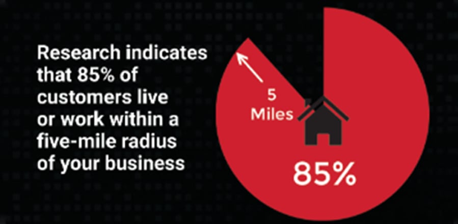
It’s my favorite infographic. A simple but powerful statistic that supports the sign industry at large and magnifies the value of digital displays. 

Read More

Tags: Knowledge

Knowing the Traffic, Counts!

Posted by admin on Feb 20, 2020 3:36:09 PM

If you do not know the traffic count on the street from which your sign is visible, please look it up. Knowing this figure can help realize the potential impact digital signage might make at your location. I love to share this data and always discuss it with clients when designing digital signage projects.

Read More

Tags: Knowledge

SM Infinity – Doodle Editor – Part 2

Posted by admin on Jan 23, 2020 12:38:49 PM

In our previous lesson, we learned how to add text layers to a Doodle. We will now look at how to animate these layers and create some special effects that will allow our Doodle and our ad on our LED sign to have a little bit more pop and a little bit more attractiveness. When working with animations, it’s very important to also know how to control the total length of your Doodle. Located above the layers ,there will be a play length set button. The set button will allow you to control the full and total length of the ad, which will be important as we start to dive into the animations. There are three types of animations: an enter animation, a hold and an exit animation. Each set of animations will have a list to choose from and in order to better assist you in selecting the correct one, there will be a preview of the animation above. For some of the animations, you’ll have further control. With the typewriter effect, you can have the typewriter effect appear for each letter, each word, or the entire line. When you are happy with the animation that you would like to apply to the “A Great Day” layer, select “Add to Timeline.” You will now see the effect on the enter effect line to the right. You will also see under the effect name “two seconds.” Let’s say that you want your animation to be a little bit longer than two seconds. Select the clock icon in the lower right. Change the length of time and let’s preview by selecting the play button on the top right and get a feel for how long and how fast our effect is going to take. Four seconds is probably too long. Let’s go back to two and we’ll leave it at that for this demonstration. We’ll now select a hold effect. This is what the text will do in between the enter and exit. We’ll select a different effect for the exit and you’ll notice that the three together: two seconds plus two seconds plus two seconds equals six seconds. That is the total play link that we currently have set up right now. We can preview the Doodle and now we can consider putting secondary effects on the second layer, which is the “to edit” text layer. This will give you independent control of your animations. When working with multiple layers, text or otherwise, we recommend minimizing the number of effects used. We recommend using the same effects on the same types of layers to reduce the complexity and the craziness of an image. Oftentimes, simple is better and easier for the people who are viewing your sign and viewing your Doodles. The last thing to cover in this lesson is that you do have the ability to add as many text layers as you wish. We recommend using larger, simple fonts and reducing the number of lines to give your viewers the best chance to take in the message you’re trying to convey. This completes our lesson on adding text. Our next lesson will cover adding images and background videos.

Read More

Tags: SM Infinity Training

SM Infinity – Doodle Editor

Posted by admin on Jan 23, 2020 12:36:19 PM

It’s now time for you to start making your own ads. When you first launch Doodle Editor you’ll see a list of all Doodles that you’ve made and saved. It’s important to note that if today is your first day, you won’t see anything in there, but as soon as you start creating, you’ll start to see your list grow. Each Doodle will have some basic information that will help you sort and locate what you’re looking for, including name, height, width, how long the play length is and when the last date it was modified. You’ll also see a short little preview on the right side to help jog your memory of which doodle you’re looking at. Today we’re going to start with creating our own, new project; our own new Doodle. Once you start your new Doodle project, you’ll see a black rectangle in the middle of the screen. This represents the aspect ratio of your display and the doodle that you’ll create. You’ll also notice the pixel height and pixel width of the Doodle you’re creating. We can now look at the blue buttons on the left side of the Doodle Editor. These buttons help change how you view the black rectangle. You can zoom in, you can zoom out. You can also move, with the hand tool, where the black rectangle sits. You can add grid lines and a border line to help reinforce the image that you’re looking at. These will all be helpful in helping make sure that your best seeing what will be going on to the display, once your doodle is saved and loaded to your sign. The green buttons located above the blue are where we will add text, add images, change the background color, add special links to RSS feeds, and save our Doodle once we are completed and ready to load for the sign. Let’s start by changing the background color. The default is black, but you can change the color to any color that you wish. Located at the bottom are some samples that are some default colors and you’ll also notice the background color slider, which allows you to choose and select a specific color based off an RGB color scheme. When selecting background colors for your LED display, we recommend focusing on darker colors: blacks, dark reds, dark blues, dark greens. These perform significantly better than all-white backgrounds. For our first Doodle, we’ll select a dark red background. Let’s now put some text on our Doodle. As soon as I select the text tool, you’ll see that I’ve got a text one box, which is also the text one layer on the right, and you’ll see in the center where I can actually modify the text on the layer that is shown on the Doodle. It’s a great day so let’s go ahead and tell the world that. We’ll start with positioning this in a spot that might be more aesthetically pleasing. You’ll see that I’ve got full control over where I can place this ad, and I can also use the blue alignment buttons that are shortcuts to allow us to place it somewhere on the display that we think best fits. I particularly like the align center button. After placing the location of the text, we can now change the style, that includes the font. We can make the font bold or italicized. We can change the font size if we wish. Please note that if any part of your text or image falls outside of the black rectangle, or in our case the red rectangle now, it will not display on the sign. The word day will not appear once it’s scheduled to play on your sign. So let’s move that down a little bit. Let’s find a more appropriate font size, and then let’s center it again. You have full control over the text color using the RGB sliders or any of the color samples below. It’s important to pick colors that are contrasting with the background. It makes it easier for the eye to see and we recommend using an outline to increase the visibility and the legibility of your words and fonts when displayed on your sign. We now have a great first text layer so let’s add a second. We will position this first text layer a little bit higher on the display and when we add the second text layer, notice that the layer has the same properties as the first layer. We’ll change the text. We’ll align it, and it’s important to note that right now you’ll see that “to edit” is above “A Great Day.” We can change the order of these layers by using the up-and-down blue arrow located in the lower right hand corner. This will allow you to move any layer, whether it’s text or image, in front of another to get the desired effect. We can also move this second layer to anywhere on the display we like and can control its properties independently. So for the sake of training, let’s make this second layer blue and we’ll position it to best fit on the display. You can add as many text layers as you like. We recommend trying to minimize the amount of text that you do put on an advertisement. Once you’re ready for this to be completed, we will now save our Doodle with a name that best represents what this ad is, and allow us to search and find it at a later date.

Read More

Tags: SM Infinity Training

Something Powerful

Tell The Reader More

The headline and subheader tells us what you're offering, and the form header closes the deal. Over here you can explain why your offer is so great it's worth filling out a form for.

Remember:

  • Bullets are great
  • For spelling out benefits and
  • Turning visitors into leads.

Recent Posts